Toronto subway stations actually had a smart design until the TTC ruined it
Chris Middleton
created: May 10, 2025, 4:01 a.m. | updated: May 12, 2025, 2:07 p.m.
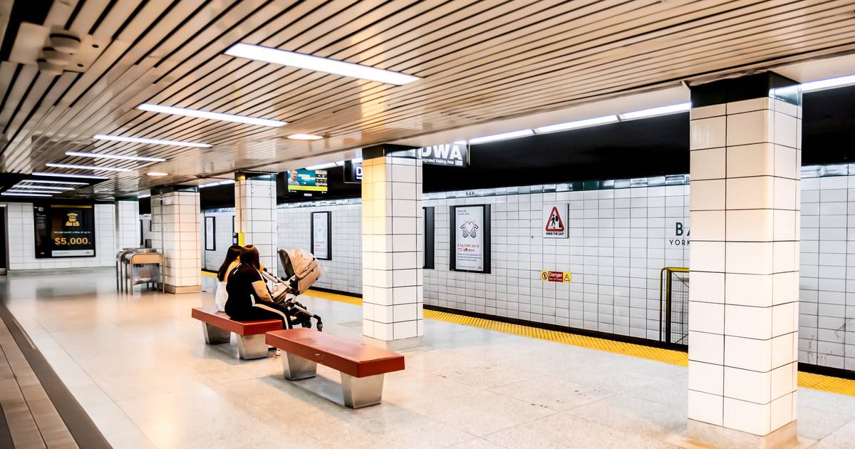
Sometimes sticky and often dreary, for better or worse, Toronto’s subway stations have a distinct look to them that can sometimes feel a bit random.
Recently, the Youtuber Not Smooth Steve dug into the little-known history of the TTC colour coding that used to define the city's stations.
Thanks to Steve, we now have an overview of how subway stations used to look in Toronto and, with a little cursory research, what exactly went wrong.
The TTC's originally commissioned font, known simply as "Toronto Subway," has had a rocky history with a lot of inconsistencies.
But 2002 saw a return to form, with all new subway stations pivoting back to using "Toronto Subway."
4 weeks, 1 day ago: blogTO