Show HN: Windows 7 GUI for the web
khangnd
created: July 27, 2025, 5:27 p.m. | updated: July 27, 2025, 10:18 p.m.
FacebookAmazonAppleNetflixGoogle Show code < ul role = "listbox" > < li role = "option" > Facebook </ li > < li role = "option" aria-selected = "true" > Amazon </ li > < li role = "option" > Apple </ li > < li role = "option" > Netflix </ li > < li role = "option" > Google </ li > </ ul > Copy Code The latter offers more flexibility over using a mere select element.
ViewSort by Name Size Item type Date modifiedRefreshPastePaste shortcutScreen resolutionGadgetsPersonalize Show code < ul role = "menu" style = "width: 200px" > < li role = "menuitem" tabindex = "0" aria-haspopup = "true" > View </ li > < li role = "menuitem" tabindex = "0" aria-haspopup = "true" > Sort by < ul role = "menu" > < li role = "menuitem" > < a href = "#menu" > Name </ a > </ li > < li role = "menuitem" > < a href = "#menu" > Size </ a > </ li > < li role = "menuitem" > < a href = "#menu" > Item type </ a > </ li > < li role = "menuitem" > < a href = "#menu" > Date modified </ a > </ li > </ ul > </ li > < li role = "menuitem" > < a href = "#menu" > Refresh </ a > </ li > < li role = "menuitem" > < a href = "#menu" > Paste </ a > </ li > < li role = "menuitem" > < a href = "#menu" > Paste shortcut </ a > </ li > < li role = "menuitem" > < a href = "#menu" > Screen resolution </ a > </ li > < li role = "menuitem" > < a href = "#menu" > Gadgets </ a > </ li > < li role = "menuitem" > < a href = "#menu" > Personalize </ a > </ li > </ ul > Copy Code By default, the submenu is only shown when the linked item is focused/clicked.
</ li > < li > CSS < ul > < li > Selectors </ li > < li > Specificity </ li > < li > Properties </ li > </ ul > </ li > < li > < details open > < summary > JavaScript </ summary > < ul > < li > Avoid at all costs </ li > < li > < details > < summary > Unless </ summary > < ul > < li > Avoid </ li > < li > < details > < summary > At </ summary > < ul > < li > Avoid </ li > < li > At </ li > < li > All </ li > < li > Cost </ li > </ ul > </ details > </ li > < li > All </ li > < li > Cost </ li > </ ul > </ details > </ li > </ ul > </ details > </ li > < li > HTML </ li > < li > Special Thanks </ li > </ ul > Copy Code The has-connector class may be used to render a dotted border to illustrate the structure more clearly, and the has-collapse-button class to change the expand/collapse carets to buttons.
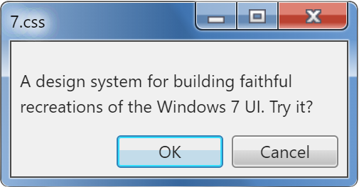
You may also use "Minimize", "Maximize", "Restore" and "Help" like so: A Title BarA maximized Title BarA help Title Bar Show code < div class = "title-bar" > < div class = "title-bar-text" > A Title Bar </ div > < div class = "title-bar-controls" > < button aria-label = "Minimize" > </ button > < button aria-label = "Maximize" > </ button > < button aria-label = "Close" > </ button > </ div > </ div > < br > < div class = "title-bar" > < div class = "title-bar-text" > A maximized Title Bar </ div > < div class = "title-bar-controls" > < button aria-label = "Minimize" > </ button > < button aria-label = "Restore" > </ button > < button aria-label = "Close" > </ button > </ div > </ div > < br > < div class = "title-bar" > < div class = "title-bar-text" > A help Title Bar </ div > < div class = "title-bar-controls" > < button aria-label = "Help" > </ button > < button aria-label = "Close" > </ button > </ div > </ div > Copy Code Alternatively, you can use the is-close , is-minimize , is-maximize , is-restore , is-help classes to target the respective controls for your styling preference.
Show code < div class = "window active" style = "max-width: 300px" > < div class = "title-bar" > < div class = "title-bar-text" > A window with contents </ div > < div class = "title-bar-controls" > < button aria-label = "Minimize" > </ button > < button aria-label = "Maximize" > </ button > < button aria-label = "Close" > </ button > </ div > </ div > < div class = "window-body has-space" > < p > There's so much room for activities!
4 days, 12 hours ago: Hacker News: Front Page